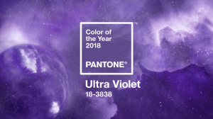
 CARLSTADT, N.J. — December 7, 2017 — Pantone — a wholly owned subsidiary of X-Rite, Inc., and provider of professional color language standards and digital solutions — today announced PANTONE 18-3838, Ultra Violet, as the Pantone® Color of the Year for 2018. A dramatically provocative and thoughtful purple shade, PANTONE 18-3838 Ultra Violet communicates originality, ingenuity, and visionary thinking that points us towards the future.
“We are living in a time that requires inventiveness and imagination. It is this kind of creative inspiration that is indigenous to PANTONE 18-3838 Ultra Violet, a blue-based purple that takes our awareness and potential to a higher level,” said Leatrice Eiseman, Executive Director of the Pantone Color Institute. “From exploring new technologies and the greater galaxy, to artistic expression and spiritual reflection, intuitive Ultra Violet lights the way to what is yet to come.” Complex and contemplative, Ultra Violet suggests the mysteries of the cosmos, the intrigue of what lies ahead, and the discoveries beyond where we are now. The vast and limitless night sky is symbolic of what is possible and continues to inspire the desire to pursue a world beyond our own.
Enigmatic purples have also long been symbolic of counterculture, unconventionality, and artistic brilliance. Musical icons Prince, David Bowie, and Jimi Hendrix brought shades of Ultra Violet to the forefront of western pop culture as personal expressions of individuality. Nuanced and full of emotion, the depth of PANTONE 18-3838 Ultra Violet symbolizes experimentation and non-conformity, spurring individuals to imagine their unique mark on the world, and push boundaries through creative outlets.
Historically, there has been a mystical or spiritual quality attached to Ultra Violet. The color is often associated with mindfulness practices, which offer a higher ground to those seeking refuge from today’s over-stimulated world. The use of purple-toned lighting in meditation spaces and other gathering places energizes the communities that gather there and inspire connection.
“The Pantone Color of the Year has come to mean so much more than ‘what’s trending’ in the world of design; it’s truly a reflection of what’s needed in our world today,” added Laurie Pressman, vice president of the Pantone Color Institute. “As individuals around the world become more fascinated with color and realize its ability to convey deep messages and meanings, designers and brands should feel empowered to use color to inspire and influence. The Color of the Year is one moment in time that provides strategic direction for the world of trend and design, reflecting the Pantone Color Institute’s year-round work doing the same for designers and brands.”
Ultra Violet in Graphic Design and Packaging
As packaging design becomes more sophisticated, Ultra Violet offers complexity and nuance that appeals to our desire for originality in all that we touch. Similarly, in graphic design, Ultra Violet resonates with this dynamic medium through its multi-dimensional feeling. Shades of Ultra Violet are increasingly used in packaging and graphic design by forward-looking brands in the CPG, luxury, and beauty worlds as well as by personalities and artists seeking to stand out.
Ultra Violet in Food
Considered exotic and enticing, purple fruits, vegetables, and starches, such as acai, purple shaded cauliflower, yams, carrots, asparagus and cabbage are also known for their natural health benefits. These new “it” foods are naturally rich in nutrients and antioxidants, and also bring vibrancy and sophistication to the table.
Ultra Violet in Fashion
On the runway or the streets, Ultra Violet is an enchanting purple that provides a theatrical linkage for both men’s and women’s styles. True to the coupled nature of Ultra Violet, created by combining red and blue, Ultra Violet lends itself to unique color combinations in fashion and is easier to pair with all colors on the spectrum than one might think. With golds or other metallics, Ultra Violet becomes luxurious and dazzling; with greens or greys it evokes natural elegance. Similarly, Ultra Violet takes on distinct appearances with different materials. Lush velvets in the color suggest intrigue for evening, but are also unexpectedly modern in athleisure or sneakers. In accessories, jewelry, and eyewear, Ultra Violet suggests the complexities of natural gems, textures, and florals.
Ultra Violet in Beauty
Ultra Violet becomes spell-binding and steeped in spirituality in beauty to create expressive looks for all. The complex and deep nature of the color is well-suited for beauty looks created by combinations, blends, and ombres. A singular matte purple on the lips or nails makes a bold statement of non-conformity, while softly blended metallics and shimmers in Ultra Violet transform the eyes into windows to the cosmos. Purple shades in hair continue to elevate street styles as a symbol of creative expression. On the palette for every beauty medium, Ultra Violet complements and emboldens every other color, adding complexity and mystery.
Ultra Violet in Home Décor
In interiors, Ultra Violet can transform a room into one of extraordinary self-expression, or conversely its polish can tone down a room with subdued, modern pairings. Adding spice and brightness, Ultra Violet calls attention to a tufted couch, piece of art or accent wall. As a color that can take you in so many directions, Ultra Violet makes a statement in any space, whether it’s one of tradition and elegance or unexpected boldness. In hospitality, we are seeing purples like Ultra Violet take center stage in interior spaces as large and small hotels harness color and design to entice travelers and stay relevant.
Saatchi Art x Pantone Color of Year 2018 Collection
As an expression of the imagination and creativity that Ultra Violet provokes, Pantone has partnered with Saatchi Art (saatchiart.com), the world’s leading online gallery for emerging art, to create a limited-edition collection of official Pantone Color of the Year 2018 prints. The collection, available for purchase beginning January 1, 2018, will include new works by international artists, working in painting, sculpture and printmaking, that embody the spirit of Ultra Violet. This collection will allow lovers of Pantone and art alike to experience Ultra Violet’s inspiration in their daily lives.
Adobe Stock x Pantone Color Of Year 2018
This year’s Pantone Color of the Year, Ultra Violet, offers a powerful tool to those who communicate visually – expressing the heart of the creative process, where originality, ingenuity, and imagination define the work. To celebrate and inspire the creative community, Pantone has partnered with Adobe Stock for a curated Color of the Year 2018 collection. With more than 100 million visual assets, Adobe Stock offers an amazing resource for visual inspiration and creative development.
Limited Edition Pantone Color of Year 2018 Guides
For the first time, Pantone will also release limited-edition collections of Pantone Color of the Year 2018 Formula Guides and Fashion, Home + Interiors Color Guides as collector’s items for designers, to enable them to more easily integrate Ultra Violet into their workflow, and drawing the connection between the inspiration that the Color of the Year offers to the color achievability and consistency that Pantone standards ensure. Guides will feature a specialized Color of the Year cover with information on Ultra Violet enclosed within the guide. Sold exclusively on Pantone.com, these guides are perfect gifts for designers who are already on the pulse of color trends, or for up-and-comers who want to deck out their desk with the sleekest tools.
Pricing:
- Pantone Color of the Year 2018 Formula Guide (Coated & Uncoated): SRP $165
- Pantone Color of the Year 2018 Fashion, Home + Interiors Color Guide: SRP $215
About the Pantone Color of the Year
The Color of the Year selection process requires thoughtful consideration and trend analysis. To arrive at the selection each year, Pantone’s color experts at the Pantone Color Institute comb the world looking for new color influences. This can include the entertainment industry and films in production, traveling art collections and new artists, fashion, all areas of design, popular travel destinations, as well as new lifestyles, playstyles, and socio-economic conditions. Influences may also stem from new technologies, materials, textures, and effects that impact color, relevant social media platforms and even up-coming sporting events that capture worldwide attention. For 19 years, Pantone’s Color of the Year has influenced product development and purchasing decisions in multiple industries, including fashion, home furnishings, and industrial design, as well as product packaging and graphic design. Past selections for Color of the Year include:
- PANTONE 15-0343 Greenery (2017)
- PANTONE 15-3919 Serenity and PANTONE 13-1520 Rose Quartz (2016)
- PANTONE 18-1438 Marsala (2015)
- PANTONE 18-3224 Radiant Orchid (2014)
- PANTONE 17-5641 Emerald (2013)
- PANTONE 17-1463 Tangerine Tango (2012)
- PANTONE 18-2120 Honeysuckle (2011)
- PANTONE 15-5519 Turquoise (2010)
- PANTONE 14-0848 Mimosa (2009)
- PANTONE 18-3943 Blue Iris (2008)
- PANTONE 19-1557 Chili Pepper (2007)
- PANTONE 13-1106 Sand Dollar (2006)
- PANTONE 15-5217 Blue Turquoise (2005)
- PANTONE 17-1456 Tigerlily (2004)
- PANTONE 14-4811 Aqua Sky (2003)
- PANTONE 19-1664 True Red (2002)
- PANTONE 17-2031 Fuchsia Rose (2001)
- PANTONE 15-4020 Cerulean (2000)
The color selected as our Pantone Color of the Year 2018 was taken from the Pantone Fashion, Home + Interiors Color System, the most widely used and recognized color standards system for fashion, textile, home, and interior design.
Posted December 7, 2017
Source: Pantone


